The pdf file of the manual is available here.
Japanese
help is here.

KaPPA-View 4
The Kazusa Plant Pathway Viewer, Version 4.0
Online Manual
ver. 1.2
![]()
Table of Contents
2. Starting the Analysis: Login and Upload of Experimental Data
2-4. Uploading Experimental Data
2-4-1. Uploading of DNA microarray data
2-4-2. Uploading of Metabolite Data
2-5. File Format of the Experiment Data
3-1. Data selection for browsing
3-2. Data browsing on the maps
3-2-1. Symbols on the pathway maps
3-2-3. Switching the Compared Experiment Pair
3-2-4. Details of genes, metabolites and enzyme reactions
Displaying the Experiment Data
4-1. Displaying the Correlation Data
4-1-1. Viewing the Correlation Data
4-1-2. Filtering the Data to view (Range of the Correlation Values)
4-1-3. Filtering the Data to View (Number of the Lines)
4-1-3. Details of the Correlation Data Displayed
4-1-4. Displaying densities of the Correlation Lines on the Bird's Eye maps
4-1-5. Uploading Users Own Correlation Data
4-1-6. Format of the Correlation Data
5-2. Comparing two experiments in a species
5-3. Utilization from the outside systems
5-3-2. POST Data Transferring Function
6-2. Expiration of the Power User
1. Introduction
KaPPA-View4 (http://kpv.kazusa.or.jp/kpv4/) is a metabolic pathway database which is aimed to better understand metabolic regulation and to generate hypotheses from huge public available 'omics' data, i.e. transcriptome, metabolome and co-expressions of the genes. This manual guides major functions of KaPPA-View4 to facilitate the beginner users to understand how to use the system.
1-1. Overview of KaPPA-View4
When you upload your own DNA microarray data and/or metabolite data to the system through the web browser, KaPPA-View4 displays the fitting of data for each gene or compound on the metabolic pathway maps. By default, approx. 150 maps are available corresponding to Arabidopsis, rice, Lotus japonicus, and tomato.
On the pathway maps, genes and compounds are represented by squares and circles respectively. The symbols are painted in different colors depending on the values such as changes in the ratio between two experiments and the amounts detected in one experiment.
On the "Bird's-Eye View Maps", you can view the summarized values for all maps and find out the pathways which have changed considerably.
Non-metabolic genes which do not exist on the maps - such as transcription factors - can be analyzed. By entering the gene IDs, you can create simplified maps.
In addition, the users can also use the pathway maps prepared by themselves.
Up to four maps can be viewed at once in a single browser window.
Furthermore, gene-to-gene and/or metabolite-to-metabolite relationships such as co-expression correlations of genes can be displayed on the maps. This is the distinctive feature of KaPPA-View and will help you, for example, to analyze the relationships between metabolic genes and transcription factors that control their expressions.
KaPPA-View4 can handle multiple species, and genes of several species can be displayed side by side on the maps. The system also provides functions to upload and view the omics data from external applications.
1-2. Downloading Sample Data
This manual guides practical operations of the system using sample data (sampleFiles.zip) which is available from the top page of KaPPA-View4 (http://kpv.kazusa.or.jp/kpv4/) or form the main window displayed just after logging-in.
As the file is compressed as ZIP, decompress the file with proper application before use.
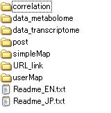
The resulted folder contains several sub-folders. Please refer to the "Readme_EN.txt" for their brief introductions.
1-3. User Setup
As KaPPA-View4 is a web-based system, it works well with major web browsers (Microsoft InternetExplorer, Firefox, Google Chrome, Safari and Opera) on any operating systems (Windows XP/Vista/7, Mac OS X and Linux).
Although the Adobe Flash Player plug-in (ver.9 or higher) is required to display the pathway maps, it is already installed in your browser in the most cases. If your browser doesn't have it, please install it according to the following site.
http://www.adobe.com/products/flashplayer/
The operation of KaPPA-View4 was tested in the following settings.
|
OS |
Windows XP / Vista / 7 (Microsoft) |
Mac OS X (Apple) |
|
Browser |
Internet Explorer 6, 7, 8 Mozilla Firefox 3.0.10, 3.5.2, 3.6.10 Google Chrome 3.0 |
Safari 4.0.4 Mozilla Firefox 3.5.6 Opera 9.63, 10.10 |
*In the case of Opera on Mac OS X, the full screen view of the maps does not work.
*Disable the pop-up blocking function of your browser. It is enabled for Safari and Opera in default.
1-4. Other Manuals
A full guide of all operations of KaPPA-View4 is written in "Manual for Users". The procedure to create User Maps using free-software "Inkscape" is described in detail in "Manual of User Map Creation". These manuals are also available form the top page of the KaPPA-View4 site.
* The Manual for Users and the Manual of User Map Creation are under preparation. They will be available in 2010.
2. Starting the Analysis:
Login and Upload of Experimental Data
For the first step of the analyses, we introduce the way to login, main menu and how to upload the experimental data to KaPPA-View4.
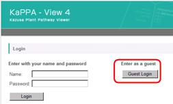
2-1. Login
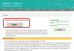
Visit to the following URL and press "Guest Login".
2-2. The Main Menu
After logging-in, you can see the main window.

On the top of the window, the main menu is placed.
![]()
· Main
Returns to the main window.
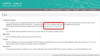
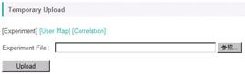
· Temporary Upload
Uploading your experimental data, User Map data and correlation data for your analyses is operated through this menu. All the uploaded data is going to be deleted completely after you are logging-out.
· Analysis
Uploaded data is displayed on the pathway maps through this menu. It serves the central function of KaPPA-View4.
· Map View
You can browse plain pathway maps with no data from here.
· Search
You can search genes, metabolites and enzyme reactions from here, and access to the pathway maps which they are on. Homology search function by blast to find genes is also provided.
· Download
The default experimental data publicly available on the KaPPA-View4 and information data for genes, metabolites, reactions and maps for each species are downloadable as text files.
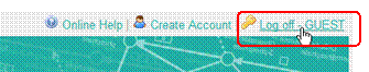
2-3. Logoff
You can logoff from the system, by clicking "Log off" on top-right of the main window.
If you don't do any operations for 60 min after you log-in, the system regards as you are log off. You are automatically log off when you close all the browser's windows too. All your data uploaded according to the next section are going to be deleted from the system after log off.
2-4. Uploading Experimental Data
2-4-1. Uploading of DNA microarray data
Press the "Temporary Upload" on the main menu.
![]()
The following window will be displayed.

Click the "Browse" button and select a data file. As an example, select a file named "Sample_Ath_gene_v***.csv" in the "data_transcriptome" folder in the sample data.
* "***" represents the version number.
Then click the "Upload" button. Following window will be displayed to check the data.
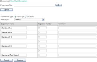
The file contains DNA microarray data of Arabidopsis. Each of the data named "Sample Ath A" and "B" is from a single experiment. "C" and "D" contain experimental duplications. In addition, a dummy data "Sample All Zero Control" is included in the file.
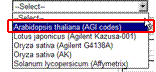
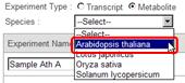
As mentioned above, this data is obtained from Arabidopsis. So select an "Arabidopsis thaliana (AGI codes)" from the "Array Type" pull-down list.
Press the "Submit" button to start uploading and registration the data to KaPPA-View4 server. After completing the process, you can see the following message. It takes a few tens of seconds.
![]()
2-4-2. Uploading of Metabolite Data
Here we demonstrate the way to upload a metabolite data file. It is similar to the case of DNA microarry data (2-4-1).
Click the "Temporary Upload" from the main menu, and select a file named "Sample_Ath_met_v***.csv" in the "data_metabolome" folder in the sample data.
The following
window will open after clicking the "Upload" button. 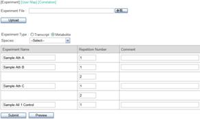
As this sample data is obtained from Arabidopsis, select "Arabidopsis thaliana" from the "Species" pull-down list.
* In actual, the sample data was generated by computational calculation, and it did not contain experimental data of the real world.
The "Experiment Type" is automatically set to "Metabolite" by the auto-recognition of the file format.
Then press the "Submit" button. Uploading will be finish with the following message.
![]()
2-5. File Format of the Experiment Data
Here we show the file format of the experiment data. Please try to open the files uploaded in the section 2-4 with Microsoft Excel.
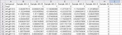
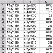
Fig. 2-5-1 Sample_Ath_gene_v***.csv
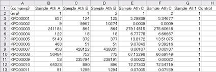
Fig. 2-5-2 Sample_Ath_met_v***.csv
You can see two rows of header in both the microarray and the metabolite data files.
The first row starts with "(arrayexp)" or "(compexp)". In the uploading process, the KaPPA-View system recognizes the experiment type by this cell. The subsequent columns of the first row are the data names.
The second row always starts with "(rep)", and the subsequent columns represent the repetition numbers. Remember that the "Sample Ath C" (and "D") of microarray data contained experimental duplication. Therefore, the repetition numbers of it were set to "1" and "2" (see the second row of Column D and E in the figure 2-5-1).
* The experimental values (see below) of the repetitions within an experiment are averaged for each gene or metabolite, and the representative values are utilized to display on the pathway maps.
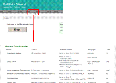
The third and the subsequent rows describe the experimental data. The first column is IDs for microarray probes (microarray data) or for compounds (metabolite data), and the second to the last columns are the experimental values.
The list of the valid probe IDs that KaPPA-View can accept are written in the statistics page which is linked from the top page of the KaPPA-View site.
*Full lists of the probe IDs are available from "Download" on the main menu (appeared after logging-in). Select "information" as "Data Type", and find the "Feature" files. The prefix of the file (Ath_, Lja_, Osa_ and Sly_) stands for the species name as listed in the Statistics page.
For associating the gene expression values detected by probe on the microarray to the probe IDs on KaPPA-View4, we prepared a Java tool "KaPPA-Average" which is available from the following URL.
http://kpv.kazusa.or.jp/kpv4/information/tools_jp.html
On the preparation of metabolite data, you have to know the compound IDs used in KaPPA-View4. Please refer to a file named "Uni_compoundInfo_yyyymmdd.csv" which is available from the "Download" menu or search the metabolite at "Search" on the main menu.
You have to input the experimental values as log scale for the probes (negative to positive real values) and as linear scale for the metabolites (positive real values except zero).
Save the data files as text files formatted in comma separated vector (.CSV).
3. Data Analysis (Basic)
Let's move on to data analyses on the pathway maps. In this section we first show the procedure how to select the data from the uploaded data set, and then explain basic functions for data browsing.
3-1. Data selection for browsing
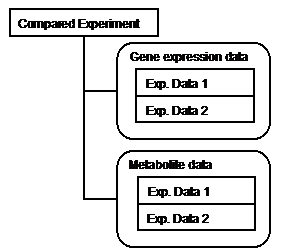
In KaPPA-View4, a unit of analyzing data is defined as a compared data between two experiments. We refer this unit a "Compared Experiment". One Compared Experiment is comprised of a pair of gene expression data, a pair of metabolite data, or both of them.
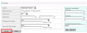
Let's try to make a Compared Experiment using the data uploaded in the section 2. Click "Analysis" on the main menu.
![]()
A data search window will appear. Please check that "Arabidopsis thaliana" is selected as "Species" and "TRANSCRIPT" for "Experiment Type". Then press the "Search" button.
On the lower part of the window, a list of data which are currently available will be displayed.
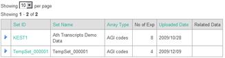
The data
uploaded in the section 2 is registered under the Set Name "TempSet_000001".
A list of experiment data contained in the experiment set is shown by clicking
the arrow head (![]() ).
).
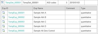
Click the data
icon (![]() ) on the left of the
experiment data "Sample Ath A". The name is appeared in the top-right
panel.
) on the left of the
experiment data "Sample Ath A". The name is appeared in the top-right
panel.
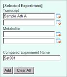
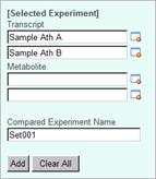
Then, click on the data icon of "Sample Ath B". The experiment name is appeared as the second one.
Let's try to select metabolite data. In this state, please check on "METABOLITE" for experiment type and press "Search" button.
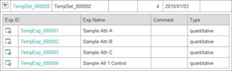
The second data temporary
uploaded is registered under the Set Name "TempSet_000002". Expand
the list by clicking arrow head (![]() ),
and select experiments "Sample Ath A" and "Sample Ath B".
The top-right panel will be like this.
),
and select experiments "Sample Ath A" and "Sample Ath B".
The top-right panel will be like this.
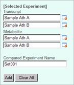
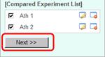
Let's register this combination of experiment data as a "Compared Experiment". Please type "Ath 1" in the "Compared Experiment Name" field, and press "Add" button. At the bottom of the top-right panel, the Compared Experiment Name will appear.
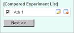
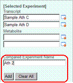
You can register more than one Compared Experiments. Try to register next One. Select "TRANSCRIPT" for experiment type, press "Search" button to show the data list, select the experiment data "Sample Ath C" and "Sample Ath D", and register this setting as Compared Experiment named "Ath 2".
As described here, you can register a Compared Experiment Pair which has only microarray data.
Please push "Next" button to go to the next window.
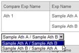
In the window, you can choose which experiment in the pair is the denominator for the ratio calculation.
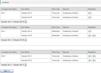
Please choose one of two from the pull down lists.
When the experimental repetition was included in the data, you can select here which repetition data should be taken account of the average calculations. By checking off the repetition ID in the "Repetition" column, the data is omitted for further analysis.

In this tutorial, it is not needed to change the settings. Please push the "Next" button, then the map browsing window will appear.
3-2. Data browsing on the maps
Using the data registered in the previous section, let's browse the data.
First of all, please select "Arabidopsis thaliana" from the pull down list on the top-left.
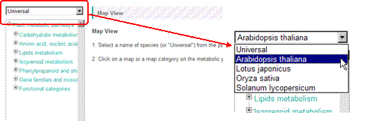
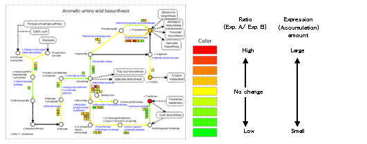
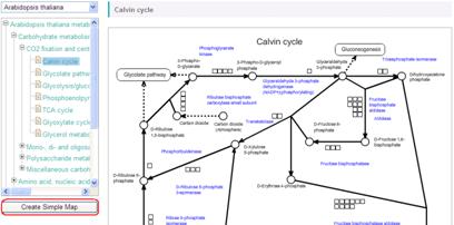
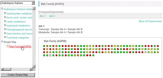
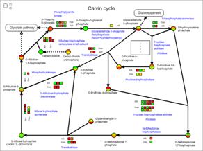
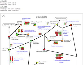
Next, select one of pathway maps in the metabolic pathway tree. An example selecting "Calvin cycle" is shown here. Symbols on the pathway maps are painted in color according to the data.
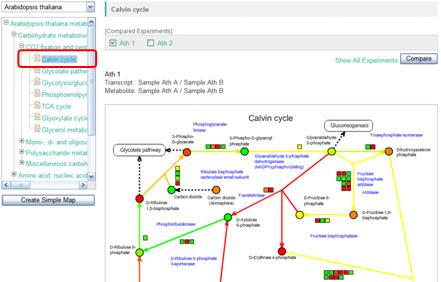
As shown here, you can browse the transcriptome and metabolome data by selecting the species and the pathway maps.
3-2-1. Symbols on the pathway maps
The elements, such as genes and metabolites, on the pathway maps are represented as symbols below.
|
Element |
Symbol |
Note |
|
genes |
|
|
|
metabolites |
|
|
|
enzyme reactions |
|
The color of the arrows correspond to the mean value of the genes assigned to the reactions. |
|
links to the other maps |
|
By clicking, the corresponding pathway maps is displayed. |
|
genes |
(Squares with "・・・・") |
When there is not an enough space to draw all the genes near by the enzyme reactions, this symbol is displayed. By clicking this, the symbols of the genes are shown in a pop-up window. |
3-2-2. Colors of the symbols
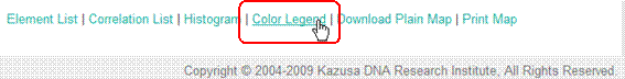
The symbol colors correspond to the values of the elements. Click on the "Color Legend" at the bottom of the window.
Relationships between the colors and the ranges of the values of transcript and metabolite changes are displayed in a small window.
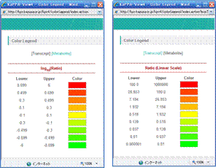
In this example, the gene symbols are drawn in red when the log10(ratio) of them in the comparison of the experiments was greater than or equal to 0.699 (5-fold change).
As shown here, the up-regulated genes and the increased metabolites are drawn in reddish color, the down-regulated genes and decreased metabolites are in greenish color, and the genes and metabolites of no-change are in yellow.
The limit value for the strongest color could be changed in the "Histogram".
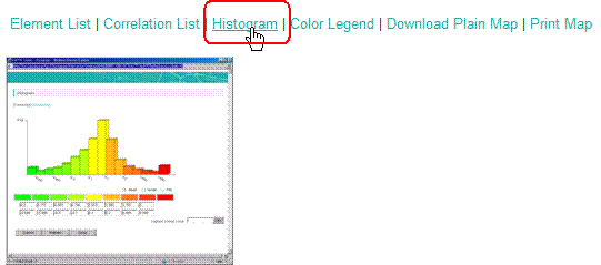
Input the limit value in the "Highest Linear Value" field. By clicking the "Calc" button, you can check the frequency distribution of the elements in each color. Push the "Submit" button to fix the setting.
(Please refer to the "Manual for Users" for details)
3-2-3. Switching the Compared Experiment Pair
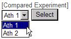
In the operation so far we selected two Compared Experiment Pairs namely "Ath 1" and "Ath 2". The data which you are currently browsing is checked in the upper control panel. In the figure below, the data from "Ath 1" is represented.
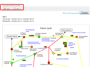
To switch the Compared Experiment Pair, click on "Ath 2". The window will be redrawn with the data of "Ath 2" and you will find "Ath 2" is checked.
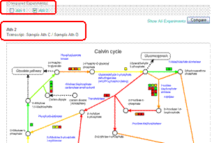
Because metabolite experiments were not included in the Compared Experiment Pair "Ath 2", the symbols for the metabolites (○) are all painted in white. The detailed sample information is represented above the pathway map.
As exemplified here, several Compared Experiment Pairs can be set in a single analysis, and users can browse each of them by switching the data. It is suitable for browsing related data sets such as time-course experiments.
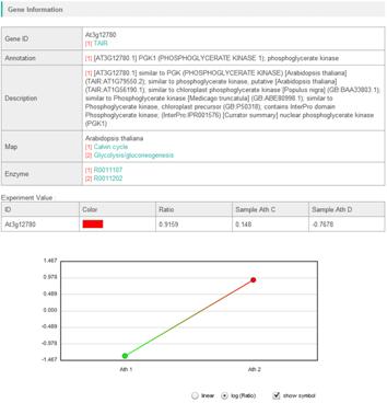
3-2-4. Details of genes, metabolites and enzyme reactions
You can get the detailed information about the symbols for genes, metabolites, and enzyme reactions, by clicking them on the pathway maps. A window will open and you can see descriptions of the element, values of the experiments and so on.
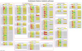
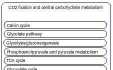
3-3. The Bird's Eye Map
We described so far about the pathway maps placed at the lowest tier (leaf) of the Pathway Tree. Now please click the middle tier of the tree (branch). Following map will appear.
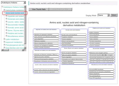
These maps are called "Bird's Eye map" in KaPPA-View4. Each of all the pathway maps included in the branch is represented as bar (indicator bar). At the first time to display Bird's Eye map, the names of the pathways are displayed in the bars. You can change the contents in the bars by choosing the items from the "Display Mode".
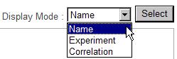
Displaying the Map Names
When the "Name" is selected for "Display Mode", the names of the pathway maps are displayed in the bars.
Displaying the Experiment Data
When you select "Experiment", the bars turn to as below.
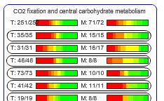
The color gradation represents followings.
Ex)
![]()
T: Transcripts
The denominator shows the number of the genes drawn on the pathway map (43 genes). The numerator indicates the number of the genes having valid values in the current data (42 genes. values for one gene was invalid).
M: Metabolites
The valid metabolite number (numerator: 8) and the metabolites drawn on the map (denominator: 14).
* The numerator and denominator values at the pathway categories are the compiled values of all the pathways included in the category.
Color gradation of the bar:
The proportion of the genes or metabolites painted in the color.
Therefore, if the bar for transcript was strongly painted in red, it implied that the pathway was activated, because expressions of a large proportion of the genes in the pathway were up.
When more than one Compared Experiment Pair have been set in the analysis, a pull-down list is displayed at the bottom-left of the Bird's Eye map. You can select the data to view here.
Displaying Correlation Data
In the case "Correlation" is selected for the display mode, densities of the correlations on the maps are displayed in the bars. Details are described later (4-1. Displaying the Correlation Data).
4. Data Analysis (Advanced)
Various functions for analyzing 'omics' data based on the pathway maps are implemented in KaPPA-View4. Each of them is described in this chapter. Combinations of the functions will provide new points of view for decoding 'omics' data.
4-1. Displaying the Correlation Data
In the recent years, a huge number of microarray data are available on public, and it contributes to generate co-expression data as a novel data resource. A group of genes which are involved in a certain biological system could be expressed in coordinate manner throughout various conditions. Therefore, focusing on the unknown genes which co-expressing with well known genes could give a hint to uncover the functions of the unknown genes. ATTED-II (http://atted.jp/), for example, is one of vanguards of such approaches, and it can list up co-expressing genes of Arabidopsis for a query gene of researcher's interest.
KaPPA-View4 provides a function to overlay gene co-expression data onto the pathway maps. Data representation in this manner helps to grasp the gene-to-gene relationships on the aspect of metabolisms. KaPPA-View4 can represent metabolite-to-metabolite correlations too.
As an index of co-expression between the genes, correlation coefficients have been typically used. Hence, the functions of KaPPA-View4 concerning to the co-expression of the genes or co-accumulation of the metabolites are referred like "correlation functions". However, the data which KaPPA-View4 accepts is not restricted in the correlations. Any data which represents gene-to-gene or metabolite-to-metabolite relationships as numerical values can be utilized. For example, protein to protein interaction data described by 0 or 1 is acceptable. Please try to project your own ideas onto the pathway maps with KaPPA-View4.
4-1-1. Viewing the Correlation Data
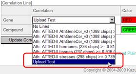
The following control panel is displayed under the pathway maps. Here, the users can choose the correlation data to view.
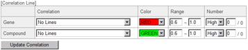
In the defaults, several gene co-expression data provided by ATTED-II can be selected. One metabolite-to-metabolite co-accumulation data calculated from a series of metabolomics data obtained from a drug treated Arabidopsis cultured cells in our laboratory is also available as a demonstration data.
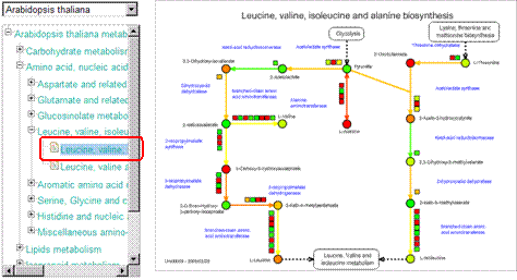
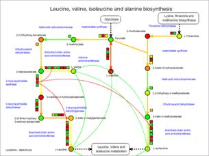
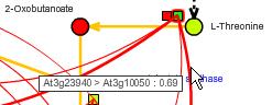
Let's try the operation. As an example, please select a metabolic map "Leucine, valine, isoleucine and alanine biosynthesis" of Arabidopsis thaliana.
Then, select the data as in the figure below, and click the "Update Correlation" button.
Smooth lines are appeared on the pathway map. These lines indicate the relationships between the genes (red) and between the metabolites (green).
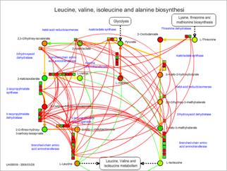
* The experiment values are represented in this figure as colors of the symbols. The correlation lines can be represented too when users are browsing the "plain maps" without experimental data.
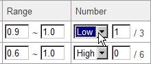
4-1-2. Filtering the Data to view (Range of the Correlation Values)
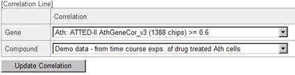
The correlation data currently selected was calculated from 1388 Arabidopsis GeneChips (Affymetrix) and the gene-to-gene relationships which showed more than or equal to 0.6 of Pearson's Correlation Coefficients were included. When the users would like to focus on much stronger relationships, they can filter the data by the correlation values.
Please enter "0.9" in the left hand field of the "Range" column. Click the "Update Correlation" button.
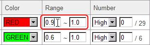
Then, only the
lines having values between 0.9 and 1.0 are displayed. 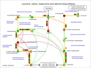
4-1-3. Filtering the Data to View (Number of the Lines)
When the ranges are changed by the way described above, a text like "/ 3" is displayed in the "Number" column. It was "/ 29" before the filtering.
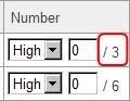
The value after the slash ("/") means the total number of the correlation lines currently represented on the maps.
*The redundant relationships of the same combination of the genes are excluded from the count. As there are in the case that the same gene is drawn at multiple places on a map, the indicated number could be different from the line numbers drawn on the maps.
*Correlations calculated in an element (self correlations) are excluded from the count even if they are included in the uploaded files.
Anyway, please enter "1" in the field written as "0" (see below), and click "Update Correlation" button.
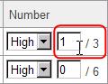
Then, only the highest correlations is drawn like the following figure.
* In this figure, three red lines are drawn. However, three gene symbols on the left hand side are for the same gene.
As shown here, by setting a number in the "Number" field, users can filter the correlation data to display the lines of highest values in the restricted range.
When you would like to view the correlation lines of the lowest values in the range, select "Low" from the pull-down list.
4-1-3. Details of the Correlation Data Displayed
You can see what genes (and metabolites) are connected by lines in the current map, and what the correlation values are, by clicking the "Correlation List".
![]()
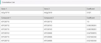
Alternatively, when the mouse cursor is over the correlation lines, the lines are highlighted and the gene IDs and the correlation values are shown in a tool tip.
4-1-4. Displaying densities of the Correlation Lines on the Bird's Eye maps
When the "Correlation" is selected for "Display Mode" in the Bird's Eye Map, users can see the line numbers on the pathway maps.
![]()
In the similar way described above, please select the data to view and the filter conditions at the bottom panel.
The numbers written beside "T:" or "M:" (numerators) show the numbers of the correlation lines on the pathway maps. The numbers after the slashes ("/") (denominators) indicate the numbers of the genes or metabolites drawn on the maps. For the indicators of the middle tiers, both of the numerators and the denominators are the sum of the line and element numbers included under the tier.
The color of the bar is decided as follows.
When defined,
D: log10( line number / element number ) of a map,
Dmax: The maximum value of D among the maps under the current tier, and
Dmin: The minimum value of D among the maps under the current tier,
the bar of the map having Dmax is painted in the strongest color (red), and the map of Dmin is painted in the weakest color (green).
Therefore, the maps having dense relationships are painted stronger colors.
*Correlations calculated in an element (self correlations) are excluded from the line number counting, even if they are included in the uploaded files.
4-1-5. Uploading Users Own Correlation Data
Users can upload their own correlation data to KaPPA-View4 and utilize them in the analysis.
Click "Temporary Upload" on the Main menu, and select "Correlation" tab.
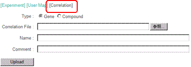
Here, let's upload a sample data. The sample data can be downloaded from the top page of the KaPPA-View4.
Press the "Browse" button and select a file named "Correlation_Ath_Gene_v***.csv" in the "correlation" folder in the sample data.
Input a short description of this file as "Upload Test" into the "Name:" field. The "Comment" field can be left as blank.
Press the "Upload" button. After waiting for a while, the uploading process will finish with the following message.
![]()
The data uploaded here can be seen in the pull-down menu of the correlation data.
4-1-6. Format of the Correlation Data
Please open the file "Correlation_Ath_Gene_v***.csv" with Microsoft Excel.
*As the row number in the file exceeds the Excel's capacity, the whole data could not be shown. But anyway, you can check the format of the file.
In the case of gene correlation data, a row consists of three columns, i.e.
gene ID, gene ID, and value (correlation coefficient).
In the case of metabolite correlation, a row contains
compound ID, compoundID, and value (correlation coefficient).
The data file must be saved in a comma separated vector (CSV) format.
4-2. Simple Map
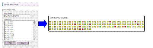
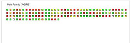
As KaPPA-View represents the gene expression data in the symbols on the pathway maps, the genes not drawn on the maps cannot be analyzed. While the microarray data and co-expression data include a lot of non-metabolic genes and unknown genes. To expand the target genes for the analysis, KaPPA-View4 serves a function creating a "Simple Map" according to the gene ID list users input. Square symbols for the genes in the ID list are arrayed on the simple map.
A full list of gene IDs used in the KaPPA-View system is available from the "Download" page.
Click "Create Simple Map" button, appeared under the pathway map tree.
* When "Universal" is selected, the button is not displayed. Please specify a species.
A following window will open.
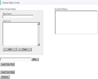
Let's create a Simple Map from gene ID list in the sample data. Push the "Browse" button and select a file named "myb_agris.txt" in the "simpleMap" folder. By clicking the "Load From File" button, the gene IDs written in the file is read and displayed in the Gene List area.
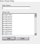
* You can input the gene IDs directly in the Gene List area.
* By clicking the "Load From Map", the gene IDs on the pathway map currently viewed is displayed in the Gene List area.
Input "Myb Family [AGRIS]" as Map Name and press "Add" button.
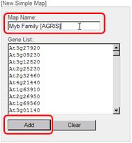
Then, the registered map name is appeared in the "Created Maps" area.
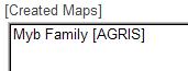
Click the "Redraw" button to redraw the pathway tree in the main window. Finally, close the window.
The registered map is appeared under the new branch named "Simple Map" in the pathway tree. You can use it for your analyses same as the default maps.
4-3. Creation of Multiple Map
In KaPPA-View4, at the maximum of 4 maps are simultaneously displayed on a single browser window. This mode of view is called "Multiple Map Mode" which would help you to overview transcriptome and/or metabolome changes in related metabolic pathways. The user created Simple Maps (4-2) and the User Maps (described later) can be included in the Multiple Maps too. Moreover, the correlation lines (see 4-1) are drawn across the each metabolic map. Therefore the Multiple Map Mode provides an important basis for exploring regulatory mechanisms between genes and the metabolic pathways such as relationships between a transcription factor gene and metabolic pathways governed by the gene.
At the bottom of the pathway map, you can see a button named "Add Related Map". Click the button, then a pop-up window will appear.
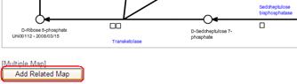
# When "Universal" is selected, the button is not displayed.
In the pop-up window, you can set a combination of the maps. In the Multiple Map Mode, top-left panel of the tiled maps is automatically set to the one which is currently viewed (selected in the pathway tree of the main window). Therefore, "Current Map" is written in the top-left panel, and you would select here the other 3 maps, i.e. top-right, bottom-left, and bottom-right panels. By clicking a map name in the pathway tree of the pop-up window, thumbnail of the map will be added to the preview area sequentially in the order above.
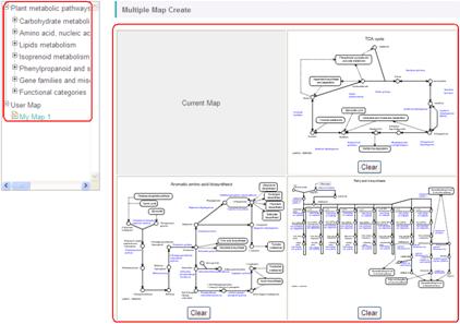
# You don't have to select all of 3 maps. Selection of only one or two maps is acceptable.
After selecting the maps, enter a name of the combination in the "Name" field and click the "Add" button.
![]()
Next, click the "Redraw" button to refresh the main window. After that, close the pop-up window.
A pull-down list of "[Multiple Map]" will appear under the pathway map in the main window. By selecting the combination name and clicking the "Select" button, the pathway map area will be redraw to the Multiple Map Mode, and the combination of the maps will appear.
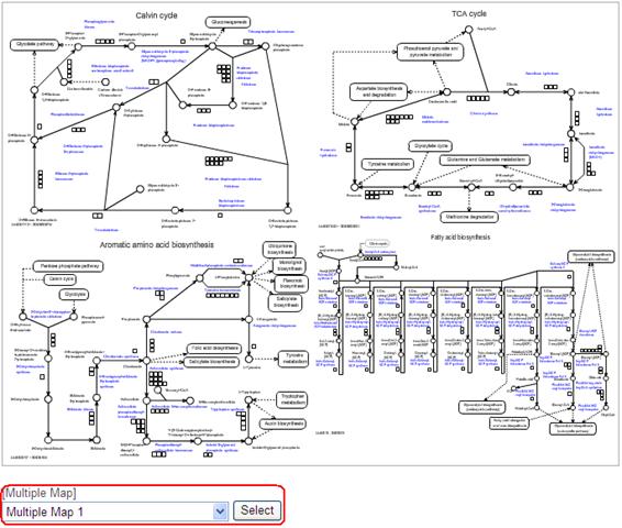
As described before, the top-left map of the Multiple Map is related to the pathway tree. You can replace the top-left map by selecting another map in the pathway tree.
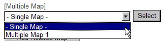
To exit the Multiple Map mode, select "- Single Map -" from the pull-down list and click "Select" button.
4-4. Utilization of User Maps
Users can create their own pathway maps and utilize them in KaPPA-View4. It would help you to analyze non-metabolic genes which don't exist on the default maps, to make more beautiful pathway representations, to analyze with the maps with careful curation of the gene assignments, and so on.
The user-created maps (User Maps) have to be prepared in Scalable Vector Graphics (SVG) format. We recommend doing it with a freeware "Inkscape". Please refer to the "Manual of User Map Creation" for the details. User defined gene IDs and compound IDs could be included in the User Map data. If the IDs and their values are written in the analyzing data, the symbols of the user defined elements are painted with color like as the pre-drawn ones on the default maps.
Let's look at the way to upload and utilize the User Maps here with a sample SVG file.
Click "Temporary Upload" on the Main Menu and select the "User Map" tab.
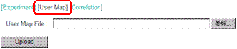
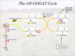
Click the "Browse" button, and select a file named "UserMap_GS-GOGAT_v***.svg" in the "userMap" folder in the sample data.
Press the "Upload" button, then a preview will appear.
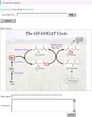
Input a map name in the "Map Name" field (here, input "User Map 1"), then click the "Submit" button. The uploading will successfully finish with the following message.
![]()
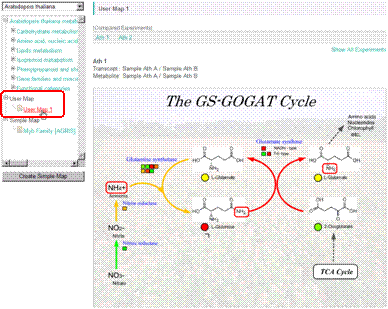
The uploaded User Map will appear in the pathway tree under the branch name "User Map". You can utilize it same as the default maps in your analyses.
5. Other Functions
In this chapter, we briefly introduce other functions of KaPPA-View4. Please refer to the "Manual for Users" for the details of each.
5-1. Universal Map Mode
There is an item named "Universal" in the pull-down list for species selection.
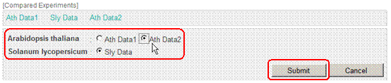
When the "Universal" is selected (Universal Map Mode), the information of all the species is displayed on the pathway maps. You can see the differences of the gene assignment to the enzyme reactions between the species.
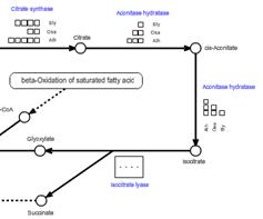
When there was not an enough space on the map to represent all the gene assignment, a box written as "・・・・" will appear. Clicking on the box, a pop-up box is displayed to view the all.
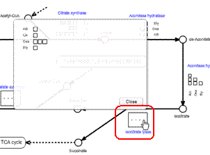
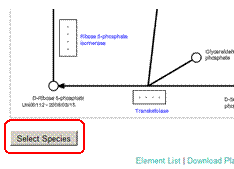
The species displayed on the pathway maps could be changed by the user by clicking the "Select Species" button at the bottom of the map.
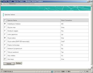
A pop-up window will be displayed. Check on the species you would like to display on the maps, and press the "Submit" button and then "Redraw" button to refresh the map on the main window.
In the Universal Map Mode, you can compare omics data between the species too.
When you set more than two Compared Experiment Sets originated from several species, an extra button "Show All" will be displayed on the top-right of the pathway map. Click the button.
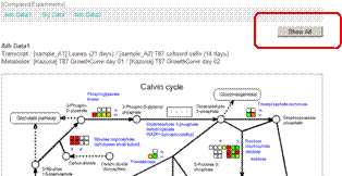
You can select one data from each species, and click "Submit" button.
Then you get the comparative visualization of gene expressions and metabolite accumulations on a single pathway map.
The Simple Maps and The User Maps which are postulated to belong to a specific species are not utilized in the Universal Map Mode. Representation of correlation lines is not available too.
5-2. Comparing two experiments in a species
If there are several Compared Experiment Pairs for a species, two of them can be represented simultaneously on a pathway map.
When several Compared Experiment Sets are set for one species, a button titled "Compare" will be appeared. Please check on two sets originated from one species and click the "Compare" button.
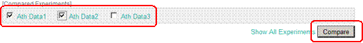
Then you get the comparative visualization of two data.
5-3. Utilization from the outside systems
KaPPA-View4 serves public interfaces to utilize the system from the outside servers and application programs.
5-3-1. URL link
By describing URLs in the following formats, developers can make links to the information page of the genes, metabolites, enzymatic reactions and pathway maps in KaPPA-View4. After jumping the user will be recognized as a guest user and he/she can continue to browse and analyze data with KaPPA-View4.
http://kpv.kazusa.or.jp/kpv4/geneInformation/view.action?id=At1g58150
http://kpv.kazusa.or.jp/kpv4/compoundInformation/view.action?id=KPC00697
http://kpv.kazusa.or.jp/kpv4/enzymeInformation/view.action?id=R0000603
http://kpv.kazusa.or.jp/kpv4/mapView/view.action?mapNumber=00006
The species can be specified too.
You can check this action with a file "ExampleUrlLink_v***.html" in the "URL_link" folder of sample data. Please open the file with the Internet browser.
5-3-2. POST Data Transferring Function
This function is provided for developers of database sites and application programs where microarray and metabolome data are deposited.
In the usual way to represent the omics data on the pathway maps with KaPPA-View4, users have to login to the system and upload data files through the KaPPA-View4 web user interfaces. The POST data transferring function (POST function) provides logging-in and data uploading environments through computational procedures without user's manual operation. Therefore, the developers can place, for example, "View" buttons in their database sites to view the data directly on KaPPA-View4.
You can find an example of the POST function in the "post" folder of the sample data. In this sample, transfer of a formatted data file is performed by post method of HTML FORM.
Open the file "ExamplePostForm_v***.html" with your Internet Browser.
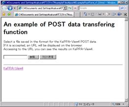
Select a sample file "Sample_postData.txt" by the "Browse" button, and then click the "Submit" button.
If KaPPA-View4 successfully accept the request, an URL will be returned. In the HTML sample, the URL is displayed on the browser window.
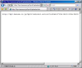
Cut and paste the URL in the address field and jump to the site.
![]()
The result will be displayed on the browser window.
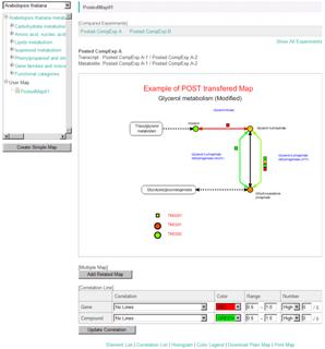
User Map data could be included in the POST data too. After jumping to the KaPPA-View4, users can continue to browse the data and start next analysis with the posted data.
Details on the transferring procedure, sample code of PHP, and the format of the data file are described in the "Manual for Users."
6. User Accounts
After logging-in to the KaPPA-View4 system as a common user (Guest User), you can create freely your own account with a simple procedure (Power User). If you get your account, you can save your own experiment data, correlation data, and User Map data on KaPPA-View4. It helps you to start the analyses immediately after logging-in. There are no differences on the analysis functions between the user authorities.
6-1. Creating an Account
Log-in as guest.
Click "Create Account" on the top-right of the browser window.
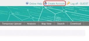
A pop-up window will open. Enter your account name and e-mail address, and then press the "Submit" button.
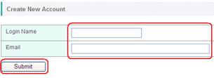
An e-mail will be sent to you immediately, and it informs you the access password.
6-2. Expiration of the Power User
The Power User account will be automatically deleted in 30 days after latest logging-in. All the data uploaded by the Power User will be deleted too. An alert e-mail will be sent to you in 21 days after last login. To keep your account, please login again before the expiration date.
6-3. Power User Login
Enter your name and password in the fields on the top page, and then press the "Login" button.
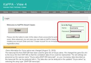
A main window for Power Users will be displayed.

6-4. Power User's Menu
There is a Power User's Menu (Side Menu) on the main page.
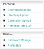
Personal Block
Here, Power Users can upload their own experiment data, User Map data and correlation data. The uploaded data will be stored in the KaPPA-View server and kept until the expiration of the account. The data is strictly administrated in the system, and is never seen by the other users.
Management of the data, i.e. deletion and edition, is available in the "Personal Data List".
Utilities Block
Password changing, and editing of user information is available here.
7. Inquiry
Please inform us all of your questions and requests about KaPPA-View4, if there are, by e-mail.
e-mail: kappa-view at kazusa.or.jp (please replace "at" to "@")
8. Editing Histories
ver. 1.2, September 21, 2010
- Some figures were updated.
- 1-3. User Settings was updated.
- Details of the operations were added to 5-1. Universal Map Mode and 5-2. Comparing two experiments in a species.
ver. 1.1, July 1st, 2010
- The first
release